Wednesday, November 17, 2010

Magazine Layout I Like..


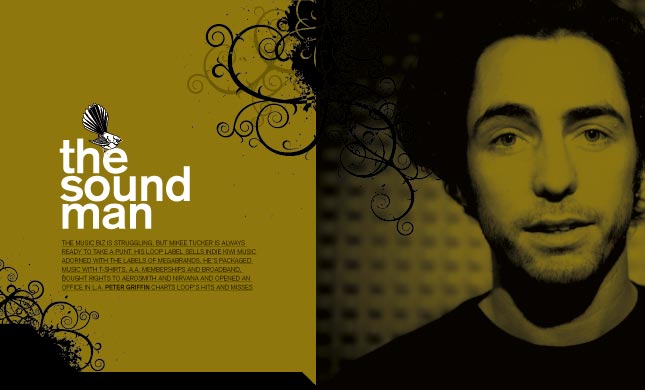
I like that the doodles come out onto the other page and it almost looks like it is a continuation of the guys hair. I like that the colours dont clash, even though this specific colour isn't one that I would chose to use.. I would like to use something like it with farther away pictures and the doodles coming out of them.. Maybe with the survey pages...?

Monday, June 14, 2010

Wednesday, June 9, 2010

Portraits.


Summer! :)


I like that in this picture you can see every little ripple in the water. I also like that you can sort of see the reflection of the bird.

Monday, June 7, 2010

Two.


This is my picture of 2. There are 2 sets of feet and 2 really visible chains. I like that it is focused on the chains and not the feet. ~Enjoy~

Wednesday, June 2, 2010

the ordinary.


This picture Was taken by the river on a sunny day however somehow the picture turned out dark. I made the picture brighter but I didn't like it as much as the dark. Here is the dark! :)

Thursday, May 27, 2010

Light and shadow!


Here are 7 of my "Light and Shadow" picture.
In the top 3 picture I was outside at about 7:30pm and the sun was still shining bright so put my nephews on the car and took a lot of pictures of them. These are the ones that turned out the best.
The photos with the big flashes of light I took at a Youth Conference (YC) in Alberta. I took them during a dance performance. The top one I photoshoped so that it almost looks unreal. Like a painting. :)
I used the lights from the side room and brought them into the small aud. and photographed Michelle in the bottom 2 pictures.

Monday, May 24, 2010

Garbage.


Here is my garbage photo. I finally got it up! I couldn't think of anything to do for garbage so I used the paper shred idea. I actually put 2 stems of flowers in each side of the broken heart. One was red and one was white symbolizing 2 sides of the equation. I fiddled around with the contrast, shadows and brightness etc. and ended up with this! It was much work to clean up but worth the picture.

Red


This is my red picture! As you can see it is a piano. I just fiddled around with the contrast a bit. At first it was just red, black and white but now it has a little bit of blue in it. The red strip in it is just a key softener for the piano.

Thursday, May 13, 2010

Extreme close up!


I did a big photo shoot of my new skates and was taking close ups of everything. i wanted to photograph then because it is something that means a lot to me and because i know that they will get wrecked the more i skate on them. I like how you can see the other skates picks in the background and how there is a tiny bit of colour on the frong blade. Just enough to give the picture some spunk. :P

Wednesday, May 12, 2010

Fragmentation photo


Michelle and I did this photo together. This single photo is actually 53 pictures put together. :)

Sunday, April 25, 2010

Weave

I weaved this by hand and took a picture of it. It is a hockey skate and a figure skate. I chose to weave those two things because I love figure skating... and am a figure skater... and I love to watch hockey, especially the NHL, on TV. Another thing I like about this picture is that I snuck in a heart with the laces to show that I like both things.

Photo of the week. Sun.


I was torn between these pictures so I decided to post both. I like the one on the top because it isn't actually focused on the sun. I often try to have a different perspective than most people, I try to make my pictures memorable by making them different from other peoples. I like the colours of both pictures. I like the bottom picture because it is taken from behind the trees so it really shows you the shapes and outline of the trees. I also like it because it looks like the sun set is a fire because the clouds give it a smoky feel.

Thursday, April 15, 2010

Photo of the week. Coffee


This is my coffee picture for the photo of the week. I like how it is not actually focused on the coffee pot but mostly your eyes are lead to the flower in the back ground.

Friday, April 9, 2010

Water! Weekly photo. #3


This is my water picture. I went down to the river and brought the nikon camera. I took pictures of skipping rocks and i turned the shutter speed up to about 1000. I like this picture because if you look closely you can see the rock in the air. I like how the splash is really clear as well.

Thursday, April 8, 2010

Random.


This is just a random picture of the snow during spring break. I love this picture because you can clearly see the snow but the lamp is still the center of attention. I also like that the lamp is off to the side and coming out of the corner. :)

Friday, March 19, 2010

Dutch Tilt!!!


This is my example of the dutch tilt. I like this picture because it persuades the viewer to believe that everything is falling. I also like that thre is a lot of lines in this picture. This was the photo of the week picture. :)

Friday, March 12, 2010

Photoshop---#2


I had a piture of a street sign called "rainbow ave" so I decided that it would be cool to put a rainbow right by it so I found a picture of a rainbow and zoomed in on it. I erased the background of the rainbow picture and put it into the sign picture to produce this! And it only took a matter of minutes!

Thursday, March 11, 2010

Photoshop---#1


The photo to the right was the original photo I took... It didn't look so great so I played around with the contrast and mostly fixed the red contrast. It made it look like it was night time and a red light was shining on the piece of grass. All this produced the picture below and it looks much better now!


I also trimmed the original photo to get rid of all the blurr on the left side. I also like how the shaddow is really visible and clear. :)

Tuesday, March 9, 2010

Picture of the week--- #1


This is the jump picture before I played around with the contrast! All Natural! :)