Wednesday, November 17, 2010

Magazine Layout I Like..


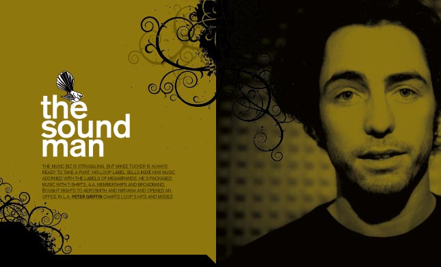
I like that the doodles come out onto the other page and it almost looks like it is a continuation of the guys hair. I like that the colours dont clash, even though this specific colour isn't one that I would chose to use.. I would like to use something like it with farther away pictures and the doodles coming out of them.. Maybe with the survey pages...?

Monday, June 14, 2010

Wednesday, June 9, 2010

Portraits.


Summer! :)


I like that in this picture you can see every little ripple in the water. I also like that you can sort of see the reflection of the bird.

Monday, June 7, 2010

Two.


This is my picture of 2. There are 2 sets of feet and 2 really visible chains. I like that it is focused on the chains and not the feet. ~Enjoy~

Wednesday, June 2, 2010

the ordinary.


This picture Was taken by the river on a sunny day however somehow the picture turned out dark. I made the picture brighter but I didn't like it as much as the dark. Here is the dark! :)

Thursday, May 27, 2010

Light and shadow!


Here are 7 of my "Light and Shadow" picture.
In the top 3 picture I was outside at about 7:30pm and the sun was still shining bright so put my nephews on the car and took a lot of pictures of them. These are the ones that turned out the best.
The photos with the big flashes of light I took at a Youth Conference (YC) in Alberta. I took them during a dance performance. The top one I photoshoped so that it almost looks unreal. Like a painting. :)
I used the lights from the side room and brought them into the small aud. and photographed Michelle in the bottom 2 pictures.